Form Elements in Firefox
Is it just me, or have form elements in the 0.8 release of Firefox for OS X taken an exceptional dive in quality? In particular, radio buttons look simply shocking – like something out of the 1980s.
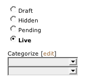
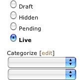
Compare and contrast these two screenshots. The first is of a fragment on the Textpattern web interface in Safari 1.2, and the second is the same region as displayed in the latest release of Firefox (0.8). The third screenshot is of the region in Camino 0.7 – another Mozilla browser.
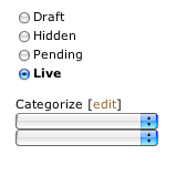
The first obvious difference is that Safari uses the operating system’s native interface widgets. This seems to be the preferred way of working, with more and more browsers opting to display form elements this way rather than attempting their own representation. With a project as large and catering to as many platforms as Mozilla does, it’s obvious why they’re using their own form elements for the time being at least.
What isn’t initially so apparent is that Safari is using the OS X mini form controls. These are compact, scaled down versions of the standard interface elements that can be used when space is tight. It’s my understanding that Safari selectively applies these based on font size. This not only makes it easier for a designer to work with forms in a small space, it also makes it easier for the user as the interface elements are specifically designed to work in said small spaces. Compare this to Camino, which uses native OS X interface elements, but not the the mini controls that Safari is able to utilize. The difference is marked, and the benefit of the mini controls becomes apparent.
Anyway, the real point of the matter is those radio buttons in Firefox. Just look at them – what a mess! Is this a problem with my system, or do they look like that for everyone? They certainly look fine on Windows.